The Christian Adulthood Initiative
Name and Logo
CAI’s previous name had no connection to its mission, so we chose to change it to “The Christian Adulthood Initiative” to put the ministry’s purpose front and center.
Then we developed a mark that simultaneously references the cross, the act of gathering together, and upward and forward motion. It symbolizes growing together around the cross.
In addition to a primary logo that strongly emphasized “Christian adulthood,” we developed a shortened monogram for use at small sizes and on mobile.
Finally, we took the condensed logo and rebranded all of CAI’s products following the design principles established in the logos.
Main Logo
Mobile Logo / Monogram
Mark
Product Logos System
Identity
We chose an abstraction to use as our primary texture or background, and derived a lush palette from it, then chose a type treatment style to use for content like blog posts and articles.
Primary Abstraction
Palette
Type Treatments
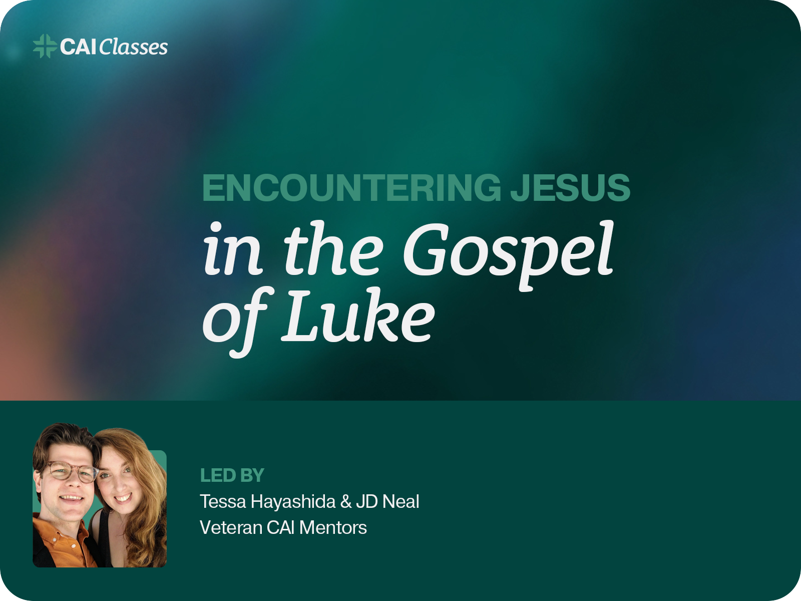
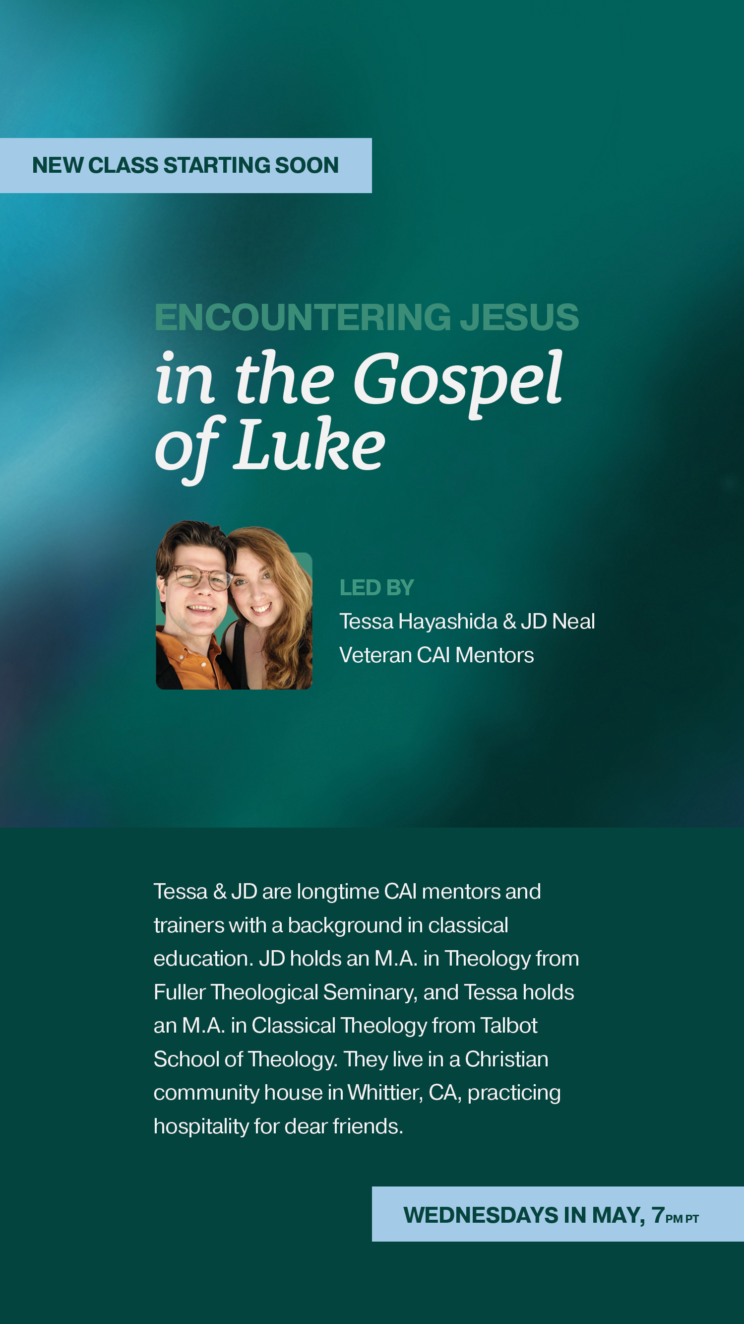
Website and Social
I also designed and maintained CAI’s whole website and social media presence.
Website
Social Profile and Marquee
Social Posts
Social Stories
Youth Camp Sub-Brand
I also developed a full identity and website for CAI’s life-changing youth summer camps. Passage Camps are rites of passage into Christian adulthood, so I used the themes of a voyage and adventure to develop a compelling range of colors, icons, and photographic treatments to spark students’ interest.
Logo
Palette
Icons
Website


