In September, three friends and I launched Lilt Co, a daring ensemble-based theater company committed to reimagining great texts in new, enveloping ways. I wanted a logo that could a) get out of the way of performance art by accommodating lots of moods, b) represent our ensemble-based, enveloping approach, and c) be used as a full logo, an abstract mark, or as one of our shorthand company names (Lilt Co, Lilt). The result is a polished, chunky, graphic logo that feels confident and strong.
Primary and Secondary Lockups
The primary logo gets used on our website header, official letterhead, and other formal locations, but the two secondary logos can be used in all other communications, including blog posts, emails, posters, and more.
Icon
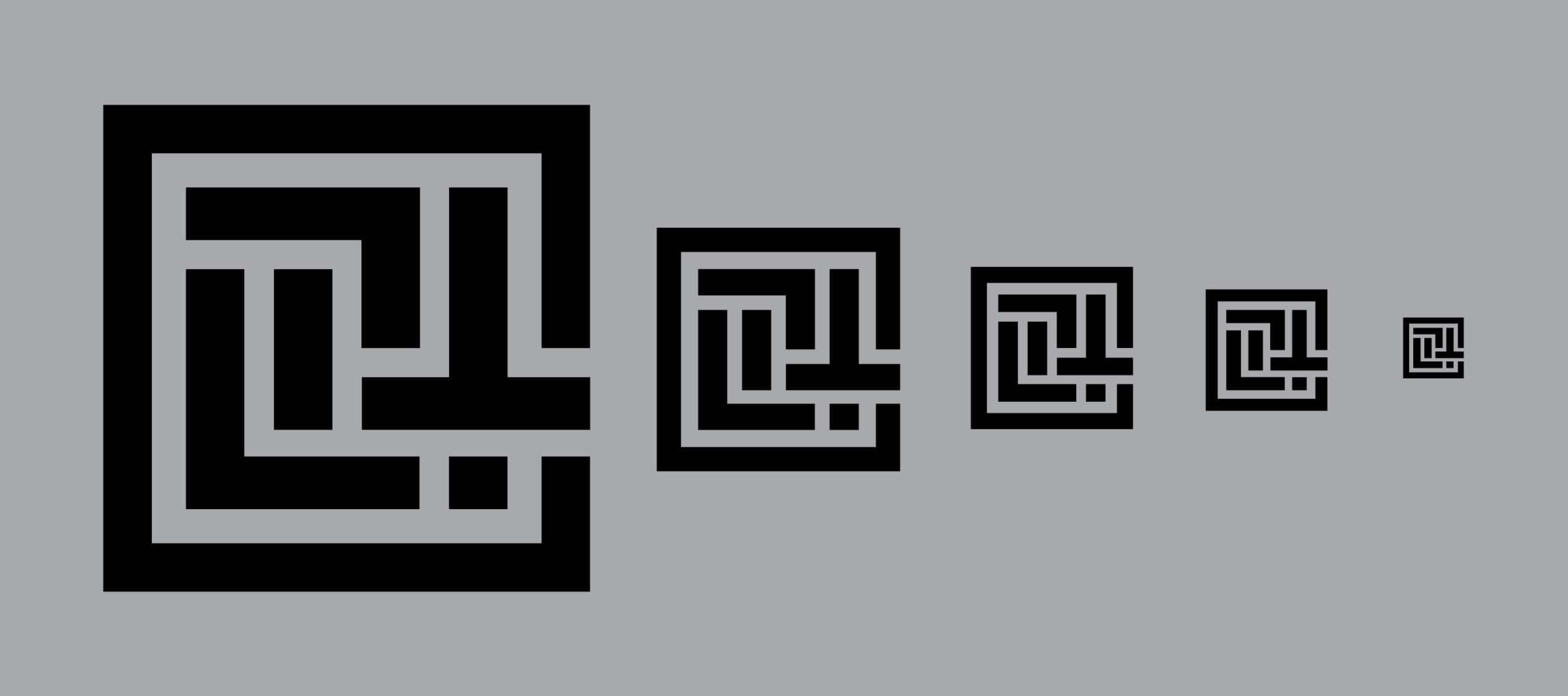
My icon is the most rewarding part of the logo. Accommodating aesthetic references to woodblock signatures (a classic, traditional reference, like the texts we work with), QR codes (a contemporary, digital reference, like the spin we put on those texts), and mazes (like the enveloping nature of our shows), it serves as an authoritative stamp on our productions.
Our plays are always performed on a thrust stage or in the round, so the outside line can represent our audience while the inner marks represent the action of the play and the ensemble members.
The inner marks also spell LILT to particularly canny observers for a nice visual surprise.
Construction
For the curious.
Summary
I made a logo that I expect will serve as a strong, professional signature for years and years of innovative productions. Though it provides plenty of rewards for close observers, it’s also a calm, competent mark that moves aside and lets the audience experience take center stage. Check out liltco.com to learn more about the company!


