Art for the Isolated is a coalition of artists and poets safely bringing art into hospital rooms for quarantined patients and caregivers, led by Joshua David Watson and Juliet San Nicolas de Bradley. I’ve been an advisor to the project since Joshua first described his hope to use his art career to help respond to the Covid-19 pandemic. I also provided the name, logo, and some basic identity ideas to help get his idea off the ground.
Name
Since the organization would need to attract donors, granting foundations, and contributors, I suggested using a name that was also a succinct mission statement. We started chopping away at the central idea: giving art to patients in Covid wards. We arrived at “Art for the Isolated” because 1) it managed to communicate both what the organization would do and why it would do it, 2) it looked and sounded elegant, and 3) it was unused and available online.
Logo
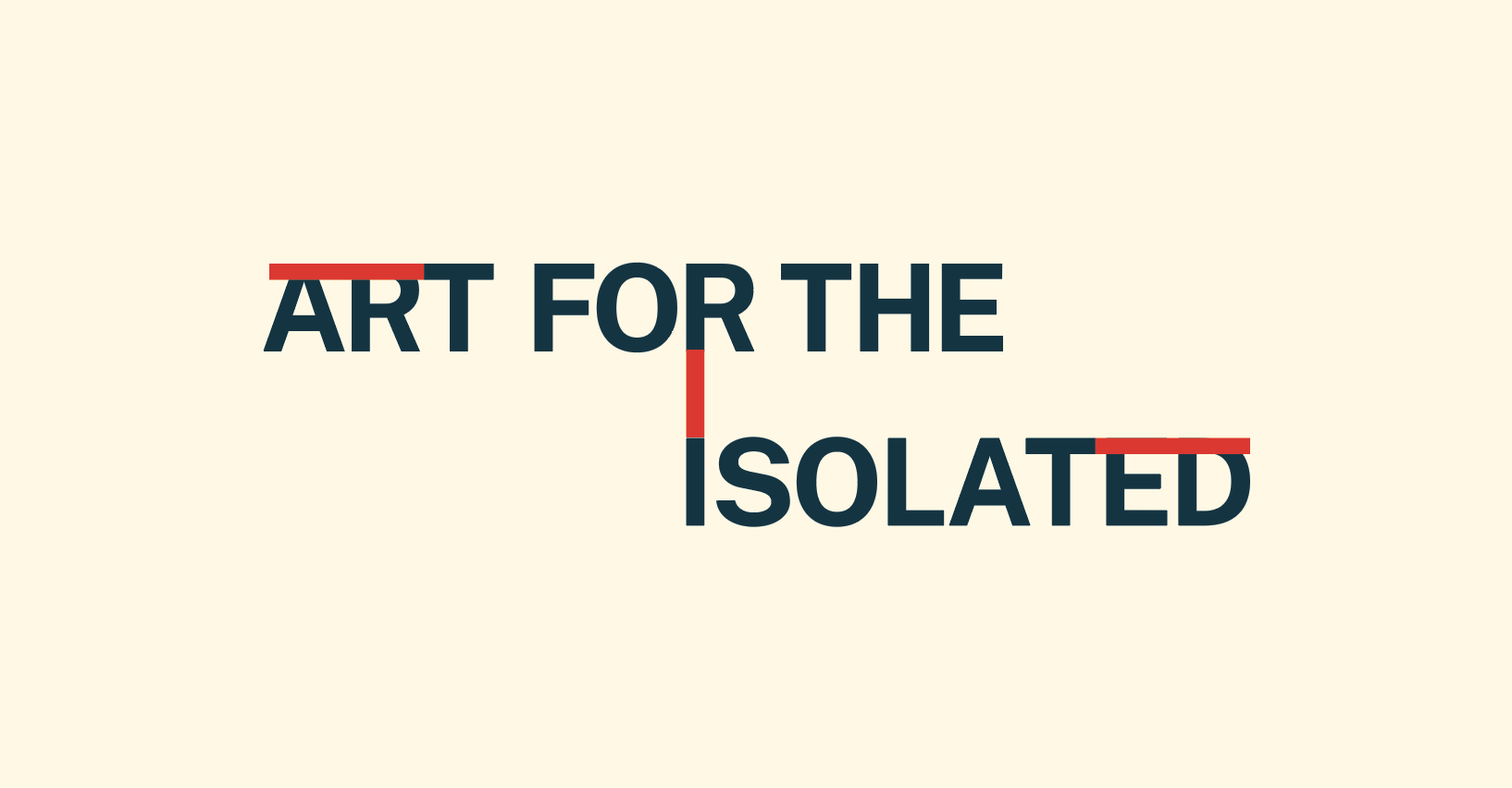
Since the real visual hero of the organization would be the donated artworks, I decided to make a logo that was as unobtrusive as possible. I wanted something neutral, but also interesting.
I settled on tightly-kerned, all caps Public Sans because it provided the neutral, institutional feel I wanted. Then I experimented with various ways to make the word “Isolated,” well, isolated from the rest of the text. After trying different container shapes around “Isolated” the best solution ended up being the simplest: moving “Isolated” below and away from “Art for the.”
Initially, I centered the “I” in “Isolated” under “Art for the.” But that made “Isolated” feel too connected to “Art for the.” By moving it farther right, I could increase the feeling of disconnection between the two lines of text.
In the end, I settled on a structure that 1) aligned the “I” in “Isolated” with the stem of the “r” in “for,” 2) used the letter “I” to space the two lines a full letter apart, and 3) adjusted the kerning so the “t” in “Art” and “Isolated” would be roughly equidistant from the sides of the logo.
That non-centered structure maintained the feeling of disconnection I wanted for “Isolation” without looking arbitrary or undesigned.
Other Identity Concepts
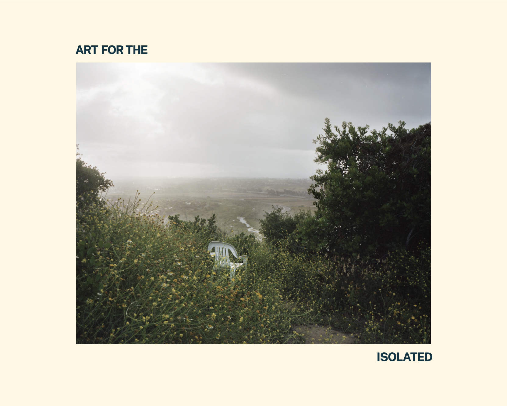
Finally, I suggested a deep green and pastel color palette to evoke hospitals and care while still playing a supporting role to the artworks themselves, and I mocked up a use of the logo that saw “Isolated” separated further from “Art for the” by placing artworks between them.
Summary
I’m grateful for the chance to help such a meaningful project by designing a name and logo that will strongly support its artworks and its cause.
Learn more about Art for the Isolated on Instagram and their website.


