My good friends Tessa & Sam married in August, and I was so tickled to be their designer. During our initial conversations, one goal for the day stood out: they wanted it to feel like a big Narnia feast. With that as a starting point, I made a wedding identity inspired by Pauline Baynes’ illustrations for the Chronicles of Narnia. I wanted the whole design world to feel a little bit like classic children’s literature, without being too fanciful or juvenile.
Logo & Monogram
In addition to a Narnia feast, Tessa and Sam wanted to reference letter writing in their design. This was a functional as well as an aesthetic decision, since they planned for their invitation, etc. to take the form of a letter to their guests. With that in mind, I decided to conceive of their logo as a signature. And as John Hancock would affirm, what’s a good signature without a good flourish?
I decided to work with James Grieshaber’s Trattatello (designed for Apple and pre-loaded on Macs) for all Tessa and Sam’s typography, because of its restrained but jolly flourishes, its just-enough roughness, and its many, many alternates. It was a good foundation, but I ended up making many customizations over the course of this project to make it seem even more handmade than it already is, and to add a certain tight bounciness that I came to enjoy for this project. Once I saw what was possible with the logo, I was sold.
Save the Date & Invitation
Their Save the Date showed off the logo to nice effect, but the real fun began with their invitations, which used the logo as a signature for the first time and combined the typography with my Baynes-inspired illustrations.
Since they were married under an oak tree, and since pomegranates were one of their primary symbols (they showed up in bouquets, on the wedding arch, and at the reception), I decided to make a border for the text from intertwining pomegranates and oak. The final touch was a few bee and butterfly friends.
The typographic work was a real beast to complete, but I’m very happy with the results.
Bulletins & Seating Charts
I reiterated and reworked what I did for invitations on the day-of materials (not least because my toddler managed to delete my more customized files on the day before the wedding). I like the stylistic continuity that guests experienced, some arriving with their invitations in hand.
Guest Gift
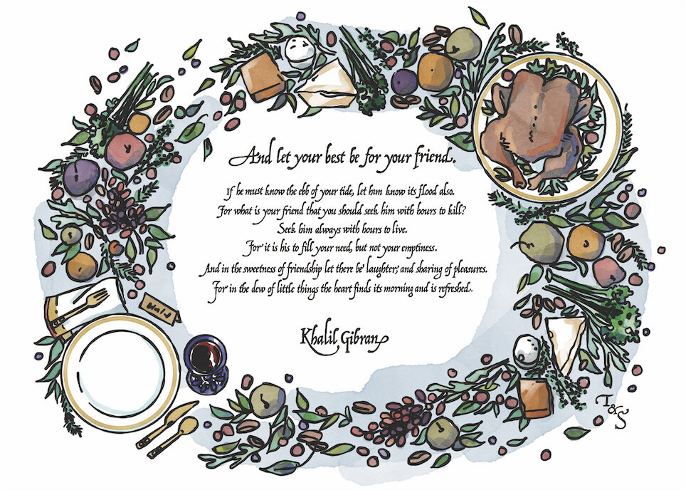
Finally (and most gratifyingly), Tessa and Sam asked me to create the thank you gift for their guests: a 5x7 illustration of their reception feast with a quote that was important to them, mailed as an art print.
Their reception easily met their “Narnia feast” goals. Guests sat at long, beautiful tables with bountiful boards of food in the middle to share: chicken, herbs, fruit, cheese, vegetables, bread, butter, nuts, and on and on. Guests made their own plates while chatting and laughing with one another, while a live band played an original song composed for the wedding.
I decided to reimagine one of those beautiful boards of food as another border for their chosen quotation, and the result is sumptuous. I’m honored to think of this piece framed in their friends’ homes: a little reminder of a truly beautiful day.
Summary
This project was one of the trickiest typographic challenges I’ve undertaken, coupled with some of the most delightful, simple illustration work I’ve had the pleasure to do. The result is a set of designs that reflect Tessa & Sam’s magnanimity, hope, and joy.


